
When we are building foreign trade independent websites, we usually insert detailed product parameters on the product detail pages. Some companies choose to insert images, while others choose to insert tables. Most Themes installed with WordPress support image scaling to adapt to screen sizes, but tables copied directly from Excel cannot achieve responsive layout, making the table content incomplete when viewed on mobile phones. Naiba here introduces how to solve this problem.
5 WordPress Plugin Recommendations
Using WordPress table plugins, we can insert responsive tables that automatically change width according to the browser window.
You can try the following 5 table plugins and choose the one that works best for you.
Ninja Tables
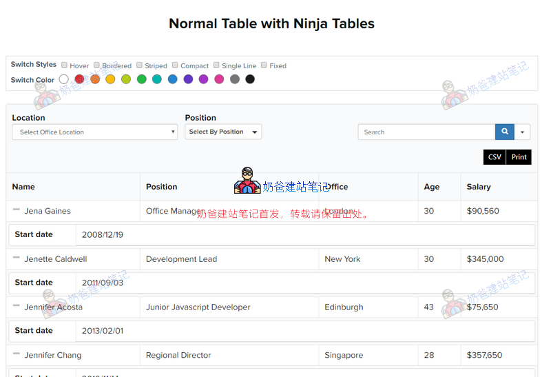
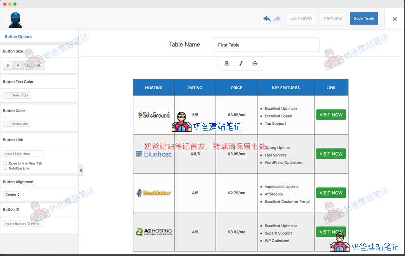
Ninja Tables is the most popular table plugin on WordPress. Using it to create product tables is actually overkill.
With Ninja Tables, whatever you think of, you can do it without writing any code! The best part is that even if you have tens of thousands of data on your table, Ninja Tables will not slow down your website! You can quickly, effectively, and easily create and manage tables from the admin panel.
Ninja Tables is very powerful, with free and pro versions. You can view demos on the download page.
TablePress
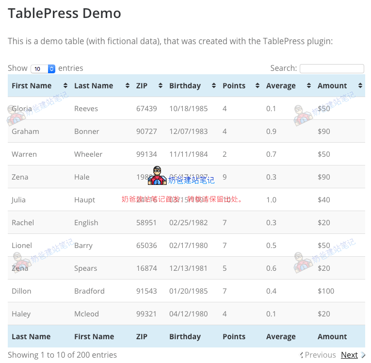
TablePress is a free table Theme,Previously, Naiba introducedTablePress is the most popular free WordPress table plugin on the market. It allows you to easily create simple and beautiful tables. It has a spreadsheet-like interface in the backend to help you add data without writing any code.
You can use shortcodes to add tables to pages, posts, and widget areas. TablePress supports filters, pagination, and sorting. It allows you to import/export tables from Excel, CSV, HTML, and JSON files. For an example of using TablePress, scroll up and see the tables in this article!
CSS3 Responsive Tables
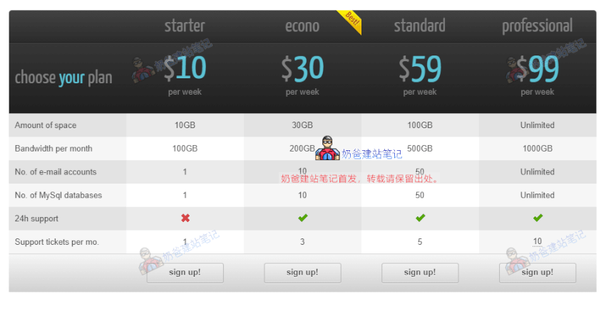
CSS3 Responsive Table is a responsive WordPress table plugin. If you want to create a price comparison table, this plugin is suitable.
It has over 20 color options, 2 table styles, active columns, hover color styles, and more. The plugin supports icons, tooltips, and ribbons. It also allows you to easily import/export data to other file formats.
Responsive Data Table
Responsive Data Table is a plugin for managing horizontal data tables in a responsive structure for desktops and mobile devices.
You can easily embed data tables into pages, posts, and widgets using shortcodes. You can split column headers into multiple sub-headers. Multiple tables with different color combinations can be used on one page.
Table data can be easily edited in table format in the WordPress admin.
WP Table Builder
WP Table Builder is a drag-and-drop table builder plugin for WordPress. Creating responsive tables with WP Table Builder is very easy.
WP Table Builder is great for creating comparison tables, pricing tables, list tables, and more.
Modify Using Code
After trying the above table plugins, you may find that directly copying and pasting tables from Excel is faster and more convenient, especially for merging cells.
So we can manually add CSS styles to the table so that it can be scrolled left and right on mobile devices.
The specific method is to switch to HTML mode after inserting the table and add the overflow:scroll; property.
Definition and Usage
The overflow property specifies what happens if content overflows an element's box.
Description
This property defines how content that overflows the element's content area is handled. If the value is scroll, the user agent provides a scrolling mechanism, whether needed or not. Therefore, scrollbars may appear even if all content fits within the element's box.
| Default value: | visible |
|---|---|
| Inherited: | no |
| Version: | CSS2 |
| JavaScript syntax: | object.style.overflow="scroll" |
Available values
| 值 | Description |
|---|---|
| visible | Default value. Content is not clipped and may be rendered outside the element's box. |
| hidden | Content is clipped and no scrollbars are provided. |
| scroll | Content is clipped and scrollbars are added to see the rest of the content. |
| auto | If content is clipped, scrollbars are added to see the rest of the content. |
| inherit | Specifies that the value of the overflow property should be inherited from the parent element. |