The New Year is approaching, and websites can also be decorated. This article teaches you how to add a pair of New Year lanterns to your website using CSS and HTML code, just like Naibabiji does.
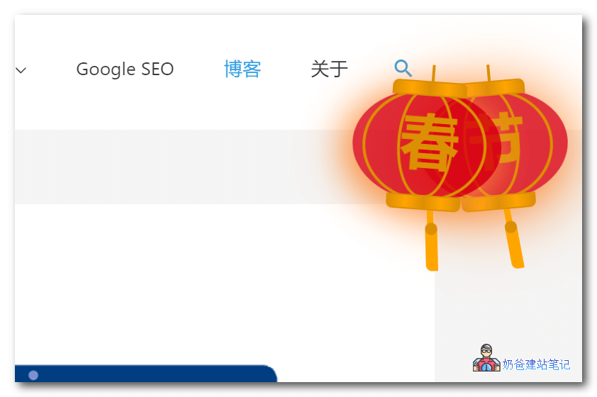
This lantern effect can be added to any website, regardless of whether it is built with WordPress or not.
The specific method is as follows:
1. Copy the code below and add it to the website's footer file.
<!-- 灯笼1 -->
<div class="deng-box">
	<div class="deng">
		<div class="xian"></div>
		<div class="deng-a">
			<div class="deng-b"><div class="deng-t">节</div></div>
		</div>
		<div class="shui shui-a"><div class="shui-c"></div><div class="shui-b"></div></div>
	</div>
</div>

<!-- 灯笼2 -->
<div class="deng-box1">
	<div class="deng">
		<div class="xian"></div>
		<div class="deng-a">
			<div class="deng-b"><div class="deng-t">春</div></div>
		</div>
		<div class="shui shui-a"><div class="shui-c"></div><div class="shui-b"></div></div>
	</div>
</div>
2. Copy the CSS code below and add it to your website.
.deng-box {
	position: fixed;
	top: -40px;
	right: -20px;
	z-index: 999;
}

.deng-box1 {
	position: fixed;
	top: -30px;
	right: 10px;
	z-index: 999;
}

.deng-box1 .deng {
	position: relative;
	width: 120px;
	height: 90px;
	margin: 50px;
	background: #d8000f;
	background: rgba(216, 0, 15, 0.8);
	border-radius: 50% 50%;
	-webkit-transform-origin: 50% -100px;
	-webkit-animation: swing 5s infinite ease-in-out;
	box-shadow: -5px 5px 30px 4px rgba(252, 144, 61, 1);
}

.deng {
	position: relative;
	width: 120px;
	height: 90px;
	margin: 50px;
	background: #d8000f;
	background: rgba(216, 0, 15, 0.8);
	border-radius: 50% 50%;
	-webkit-transform-origin: 50% -100px;
	-webkit-animation: swing 3s infinite ease-in-out;
	box-shadow: -5px 5px 50px 4px rgba(250, 108, 0, 1);
}

.deng-a {
	width: 100px;
	height: 90px;
	background: #d8000f;
	background: rgba(216, 0, 15, 0.1);
	margin: 12px 8px 8px 8px;
	border-radius: 50% 50%;
	border: 2px solid #dc8f03;
}

.deng-b {
	width: 45px;
	height: 90px;
	background: #d8000f;
	background: rgba(216, 0, 15, 0.1);
	margin: -4px 8px 8px 26px;
	border-radius: 50% 50%;
	border: 2px solid #dc8f03;
}

.xian {
	position: absolute;
	top: -20px;
	left: 60px;
	width: 2px;
	height: 20px;
	background: #dc8f03;
}

.shui-a {
	position: relative;
	width: 5px;
	height: 20px;
	margin: -5px 0 0 59px;
	-webkit-animation: swing 4s infinite ease-in-out;
	-webkit-transform-origin: 50% -45px;
	background: #ffa500;
	border-radius: 0 0 5px 5px;
}

.shui-b {
	position: absolute;
	top: 14px;
	left: -2px;
	width: 10px;
	height: 10px;
	background: #dc8f03;
	border-radius: 50%;
}

.shui-c {
	position: absolute;
	top: 18px;
	left: -2px;
	width: 10px;
	height: 35px;
	background: #ffa500;
	border-radius: 0 0 0 5px;
}

.deng:before {
	position: absolute;
	top: -7px;
	left: 29px;
	height: 12px;
	width: 60px;
	content: " ";
	display: block;
	z-index: 999;
	border-radius: 5px 5px 0 0;
	border: solid 1px #dc8f03;
	background: #ffa500;
	background: linear-gradient(to right, #dc8f03, #ffa500, #dc8f03, #ffa500, #dc8f03);
}

.deng:after {
	position: absolute;
	bottom: -7px;
	left: 10px;
	height: 12px;
	width: 60px;
	content: " ";
	display: block;
	margin-left: 20px;
	border-radius: 0 0 5px 5px;
	border: solid 1px #dc8f03;
	background: #ffa500;
	background: linear-gradient(to right, #dc8f03, #ffa500, #dc8f03, #ffa500, #dc8f03);
}

.deng-t {
	font-family: 华文行楷,Arial,Lucida Grande,Tahoma,sans-serif;
	font-size: 3.2rem;
	color: #dc8f03;
	font-weight: bold;
	line-height: 85px;
	text-align: center;
}

.night .deng-t,
.night .deng-box,
.night .deng-box1 {
	background: transparent !important;
}

@-moz-keyframes swing {
	0% {
		-moz-transform: rotate(-10deg)
	}

	50% {
		-moz-transform: rotate(10deg)
	}

	100% {
		-moz-transform: rotate(-10deg)
	}
}

@-webkit-keyframes swing {
	0% {
		-webkit-transform: rotate(-10deg)
	}

	50% {
		-webkit-transform: rotate(10deg)
	}

	100% {
		-webkit-transform: rotate(-10deg)
	}
}
After saving, refresh the frontend to see the effect.
The above code comes fromZhigengniao