 You will find that as the webpage window changes, the website layout also changes to some extent, and images automatically shrink according to the browser window. So you don't need to worry about image size issues for PC and mobile devices; it's all automatic. Meanwhile, WordPress version 5.3 also supports automatically generating responsive layout image sizes for different devices, but this feature is not always useful in certain situations. Naibabiji hasdisabled it. Disabling it will not affect the display of images when accessing the website on mobile or computer.
How to distinguish image sizes for PC and mobile on foreign trade SOHO self-built websites
Foreign trade SOHO individuals often have a question after building their own website: users will access images on their website from computers and mobile devices. So when publishing articles, how should I choose image sizes? Which size is for computers, and which for mobile devices? Actually,there's no need to worry about this issue at all. If you are using WordPress to build your website, and the website theme is from recent years, then they all adopt a responsive layout design.What is responsive layout design?It means the webpage automatically adjusts its display according to the visitor's browser size. Friends who don't understand can now move your mouse and resize the browser window of the webpage you are currently viewing, and you will see the changes. Then look at the changes in the image below.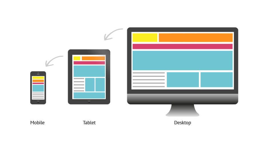 You will find that as the webpage window changes, the website layout also changes to some extent, and images automatically shrink according to the browser window. So you don't need to worry about image size issues for PC and mobile devices; it's all automatic. Meanwhile, WordPress version 5.3 also supports automatically generating responsive layout image sizes for different devices, but this feature is not always useful in certain situations. Naibabiji hasdisabled it. Disabling it will not affect the display of images when accessing the website on mobile or computer.
You will find that as the webpage window changes, the website layout also changes to some extent, and images automatically shrink according to the browser window. So you don't need to worry about image size issues for PC and mobile devices; it's all automatic. Meanwhile, WordPress version 5.3 also supports automatically generating responsive layout image sizes for different devices, but this feature is not always useful in certain situations. Naibabiji hasdisabled it. Disabling it will not affect the display of images when accessing the website on mobile or computer.🚀 Still feeling confused after reading the tutorial? Let me guide you step-by-step.
「Naibabiji WordPress Website Building Coaching Service」—From choosing a domain and buying hosting, to installing a Theme and publishing content, I「ll coach you through every step, helping you avoid detours and reach your goal directly.
👉 Learn about the Website Building Coaching Service
Comments are closed
The comment function for this article is closed. If you have any questions, please feel free to contact us through other channels.