After setting up their own website, foreign trade SOHO workers often wonder: users will access the images on my site from computers and mobile devices. So how should I choose image sizes when publishing articles? Which size is for computers, and which is for mobile phones?
Actually,there's no need to worry about this issue at all。
If you are using a website built with WordPress and the theme is from recent years, it adopts a responsive layout design.
What is responsive layout design?
That is, the webpage will automatically adjust its display according to the visitor's browser size. If you don't understand, you can now move your mouse and resize the browser window of the webpage you are viewing, and you will see the changes.
Then take a look at the changes in the image below.
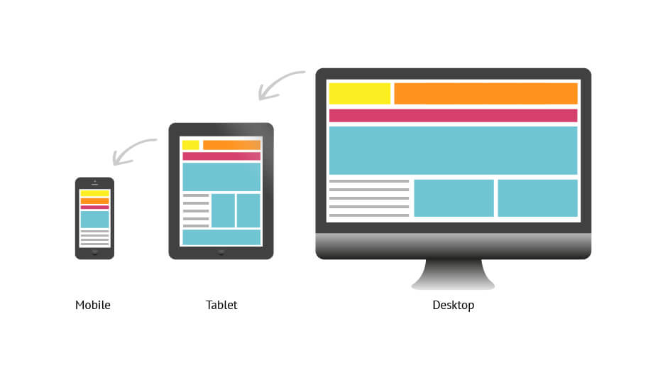
You will find that as the webpage window changes, the layout of the website also changes accordingly, and the images automatically shrink according to the browser window.
So you don't need to worry about image size issues between PC and mobile; it's all automatic.
At the same time, WordPress 5.3 also supports automatically generating responsive image sizes for different devices. However, this feature is not very useful in some cases. Naiba Web Development has already...disabled it. Disabling it will not affect the display of images when accessing the website on mobile or computer.