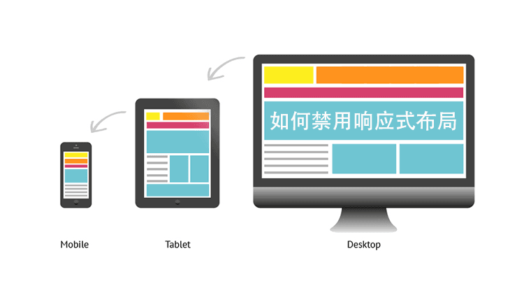
In recent years, due to the diversification of internet devices, mostWordPress Themeshave adopted responsive layout design (responsive layout). However, there are always some special website requirements that do not want a responsive layout. This article introduces common methods to disable responsive layout.
Remember to back up theme files before modifying them; if errors occur, replace them back.
Methods to Disable Responsive Layout in WordPress Themes
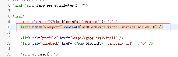
First, in the WP admin panel, go to Appearance → Theme Editor, then select the theme header (header.php) in the right editing file section.
Find the following code and delete it.
<meta name="viewport" content="width=device-width, initial-scale=1.0" />
Then modify the stylesheet (style.css) file, find code like the example below (@media screen and), and delete all of it.
@media screen and (max-width: 1210px)
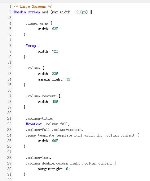
After updating the file, check the frontend to see that the responsive layout should be gone.
It is worth noting that the CSS code file to modify may vary depending on the theme, so it needs to be analyzed on a case-by-case basis.
For more information on responsive layout, refer to:Baidu Baike